


Should My Dinnerware Be... Purple?
Why I want plates this hue, according to color theory.
Over the last few years, I’ve been on a mission to find the perfect dinnerware—incessantly dreaming of stacks of handmade ceramics to fill the open shelves of my future kitchen. Balancing beauty with restaurant durability (nothing too precious for daily bumps and oopsies). I teeter between modern coupe and classic rimmed styles, but lean more coupe these days. One thing I know for sure: I don’t want white.
Now, I know what you’re thinking: white is timeless. But hear me out: color is what separates an ordinary home-cooked meal from an editorial-style spread (ok, and a talented creative team).
Though I genuinely love cooking, I recognize that I’m a very aesthetically-driven person, so adding a layer of visual intrigue enhances the overall at-home dining experience. Plus, I’m a firm believer in ‘big risk, big reward’ and purple might be the biggest risk my cabinets have ever faced.
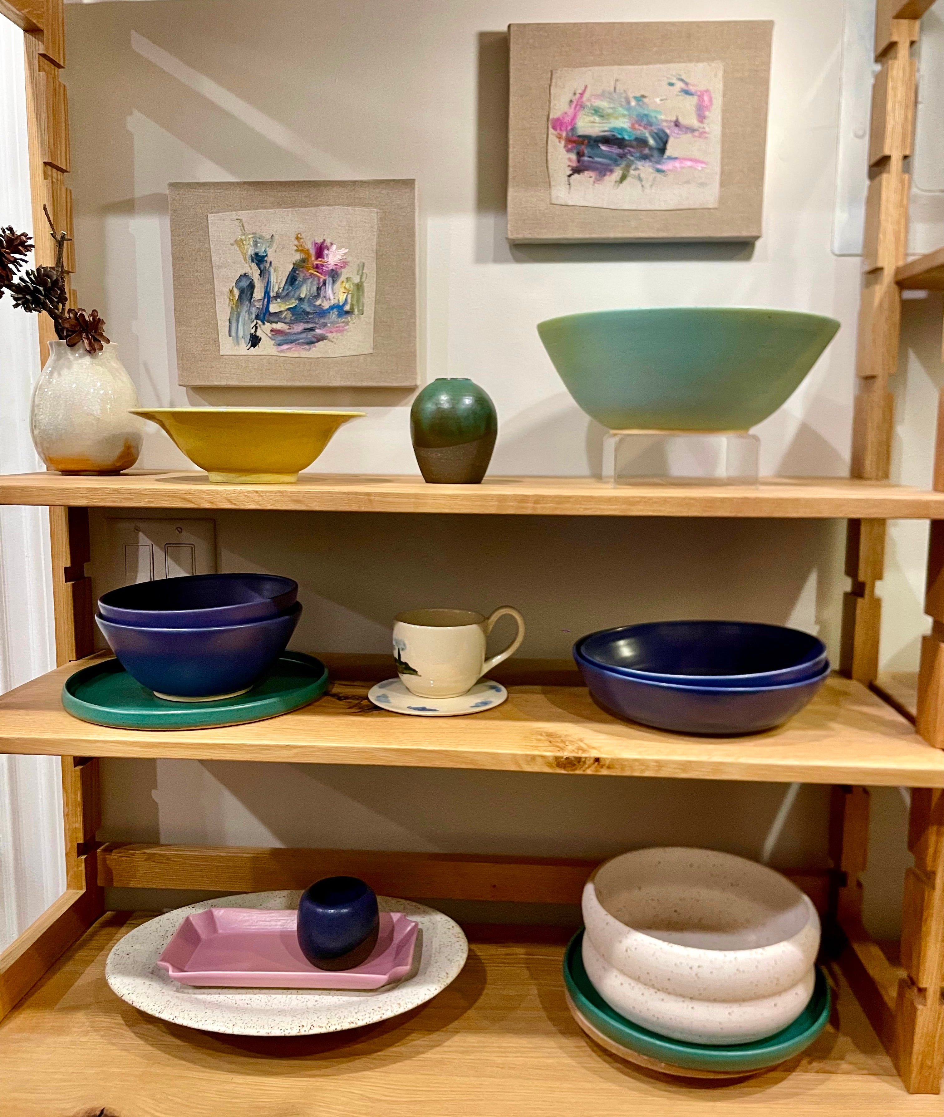
I visited ceramicist Aziza Mirzan’s newly opened studio storefront in Williamsburg and was inspired by the jewel tones and energetic colors of her pieces. I was struck by this thought: do I need my dinnerware to be purple?
I’ll admit it’s a pretty radical color for dinnerware, but the more I thought about it the more it made sense—the golden yolks of eggs or bright green of salads against a deep purple backdrop. Even my morning yogurt or a simple pasta would look fantastic—dare I say, sexy?
Let’s get into color theory
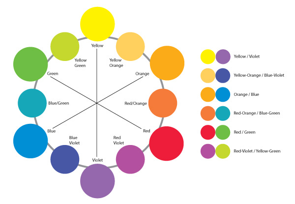
Color theory 101: purple, green, and orange are secondary colors, created by mixing primary colors (red, blue, yellow). They work well together as a color palette because they’re triadic colors, evenly spaced along the color wheel. Sitting across the color wheel is its complementary color: yellow.
So what does this mean for my dinnerware? Well, when I think about what colors I eat there’s a whole lot of green, yellow, and orange—all hues that pop with purple. And white, while not considered a color, offers a high contrast to the rich hue. Put that together and it’s feast for the eyes!
Now, into color psychology. As a mix of warm (red) and cool (blue) primary colors, purple signifies balance, stability, and serenity. It also represents creativity, magical, even fantastical, and that energy is more than welcome in my home. Purple has also long symbolized royalty and luxury, because historically it was incredibly expensive to produce, reserving it for the ultra wealthy (yuck). Centuries later that association still stands, but Elon will have to fight me for purple.


As a former tableware buyer, I’ve seen a lot of dinnerware. And I know what works: white is always top, followed by cream, grey, or other neutral, then blue, usually followed by pink. Black? Now, that’s a tough sell.
Of course there are some exceptions—when a brand does a specific color really well that’ll float to the top; mixed color sets have also been a hit in my experience.
All that to say, I’m tired of the usual suspects. And while I love red, it’s just not right for this assignment. So here I am, to my own surprise, enamored with purple. But not just any purple—no, no, it has to be a bold, cool-toned violet that brings an air of fantasy, without feeling overly feminine.
Meet my dream dinnerware
With my newfound clarity, I headed straight to Pinterest and that’s where I stumbled upon LUVHAUS, an Oakland-based ceramic studio. It was love at first sight.
Their purple glaze, aptly named ‘Aubade’—a nod to poems and music inspired by the dawn (dreamy, right?)—boasts a luminous satin-matte finish with lilac highlights and speckled undertones of rich Prussian blue. I knew right away a glaze this striking could only be custom-made.
Though color is what drew me in, the sleek silhouettes along with a comprehensive line of styles are what sold me. Plus, their entire color range is so spectacularly stunning and perfectly primed for mixing & matching.


To be fair, I’ve had many ceramicist crushes over the years and while this may be the latest, it’s serious!!! I’m not fawning over a mug or whimsical bowl—this is my dinnerware we’re talking about!
It’s also worth noting this isn’t sponsored in any way, I’m just a fan girl (lusting over ceramics way over her budget).
Someone has to stick up for purple
Every color under the Roy G. Biv sun has had its moment in the spotlight—2016 was millennial pink, 2020 classic blue, 2022 sage green, 2024 (unexpected) red to name a few—every color, but purple that is.
Technically, it has been toted by interior designers, but has failed to break into the mainstream and across industries in the same capacity as its colorful counterparts. Purple is intimidating, unapologetic, bold, and hard to pull off—but isn’t any rich color?
While I’m excited by the prospect of purple, if you need more convincing—check out these interiors:


And don’t forget about these stunning light fixtures (that are actually works of art):


So, do you like purple yet?
If you’re interested in colorful dinnerware, but not sold on purple (I get it!), I’ll share my expert Roy G. Biv recommendations in the No Crumbs chat—just drop which color your heart desires.

In case you missed previous color features:


I didn’t realize how much I needed this. when you said purple dinnerware is SEXY I was like yeah I could see that but when I saw the collage I was like DAMN THEY ARE SEXY!
need some purple dinnerware STAT