3 Ways to Microdose Color
How I created a more vibrant home and overcame my fear of color by starting small.
This newsletter is sponsored by Big Night—a major source of inspiration, frequent mention, and all-around dream collaborator for No Crumbs. If you know me, you know I’m a fan of dinners, parties, and dinner parties (aka the DNA of ’s small biz). Affiliate links ahead: I may earn a small commission if you shop, but I only share what I truly love.
I’ll confess: I wasn’t always a self-proclaimed color hunter. In fact, like many others, I was intimidated by color.
Slowly, but surely, I’ve integrated more of it into my life—stocking up on red, green, and yellow socks instead of white, reaching for my blue utility jacket over its canvas counterpart, and swapping staples for statements. Before I knew it, I rarely left the house without somehow honoring the great Roy G. Biv.
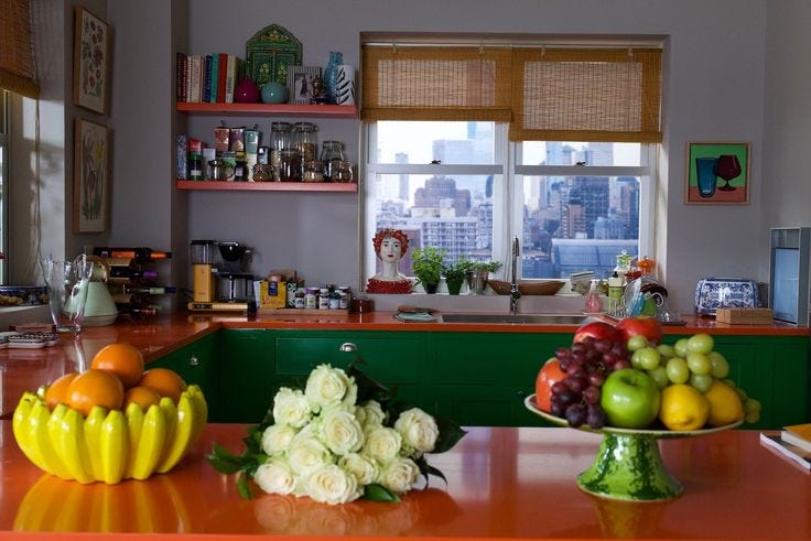
And it wasn’t just how I outwardly expressed myself, but also privately within the walls of my home. My refuge from the rest of the world became blissfully chromatic, one piece at a time.
As a homeware merchant, I’ve spent lots of time thinking about color and how to make it resonate to hesitant audiences (myself included). Between the neutral wave fizzling out, the home boom of the pandemic, and the dopamine decor that followed, color-forward home brands began popping up everywhere. And, I was finally ready to let the rainbow in.
Not only that, but I realized color was my only defense against a criminally dark New York City apartment.
When we’re prescribed color by interior designers or publications, it’s always in big doses—but most people aren’t ready to dive off the deep end. So fear not, no need to repaint your bedroom, update your cabinetry, or invest in a cobalt couch (although I stand by purple dinnerware deserving a spot at your table), we’re tackling small ways to introduce color at home.
The best way for me to overcome my fear of color was to engage with it daily—have it become something I actively interact with, not passively coexist with. This means I had to physically reach for the scary! bright-colored! object. So naturally, I honed in on kitchen and dining—admittedly, a little (or a lot) influenced by my experience as a tabletop buyer, enthusiastic cook, and unabashed homebody (I like what I like!).
Here are three ways to approach microdosing color in your home.
1. Everyday Essentials
What do you reach for around the house every day? Are any of them colorful? I didn’t know utilitarian objects could be pretty (for a while, they weren’t), which makes this approach so impactful. We’re entering an era of design that does more than marry form and function, it opens new avenues for beauty. With that, we’re celebrating the design of everyday things and welcoming aesthetically-driven, yet highly functional tools (even stylish staplers have entered the chat).
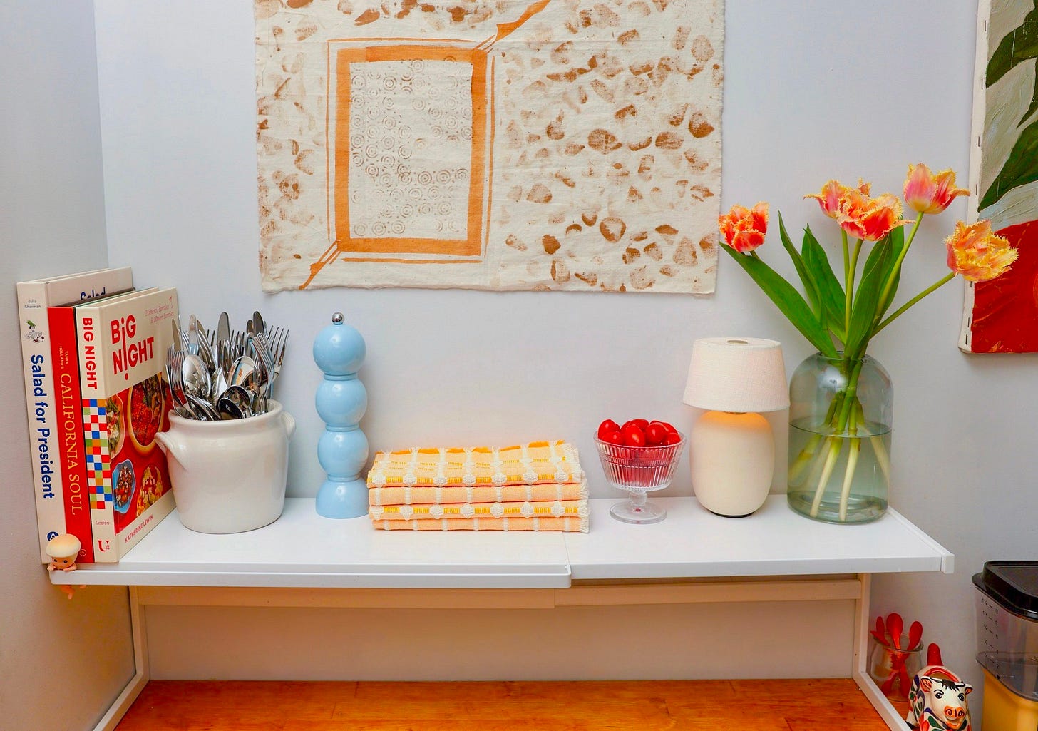
A pepper grinder brought the perfect pop of color to my kitchen and favorite ritual: finishing meals with cracks of pepper and sprinkles of flaky salt. Before it moved in, this room leaned toward warm tones, with the ever-approachable mustard and (un)expected red, but this blue lil number brought a balance I didn’t know this space needed.
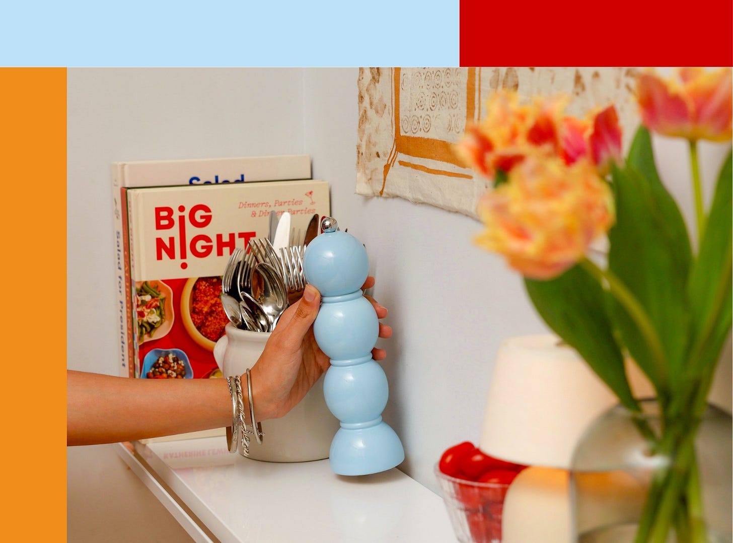
Some people collect designer bags or rare records, but I aspire for drawers full of French cutlery—Sabre to be exact. (Maybe eating is my favorite hobby?) I’m obsessed with the potential to create color combinations with food and flatware. What color utensil will I choose for a tomato soup? Sky Blue. A vibrant green salad? Orange.
While I can’t dish out on a full-blown set at this point in my life, who says I can’t start building my collection now? My plan: phase out my current flatware, replacing it with a set here and there in a slew of different colors until I have the ultimate hosting arsenal.
Till then, I got a head start with a few serving pieces, from bold spreaders to this cherry stunner—and with it, the curtain finally falls on the great bottle opener disappearing act, because this one refuses to go unnoticed.
2. Little Delights
What pieces can’t you get enough of? You know, the ones that spark joy? Maybe you have a collection of coffee mugs or massive serving bowls, like my mom. For me, it’s glassware—especially when it’s injected with color.
Whether it’s for staying hydrated or cocktail o’clock, I’m obsessed with colored glasses (never sprayed!). When I managed the drinkware category for an e-commerce shop, I realized its impact on a tablescape. Everything else could be neutral, but introducing amber tumblers transformed the scene. (Plus, it was often the most accessible price point of the place setting.)
Admittedly, I’m partial to enjoying certain drinks, like wine or a martini, from a clear vessel, but luckily, there’s stemware that brings a pop of color.
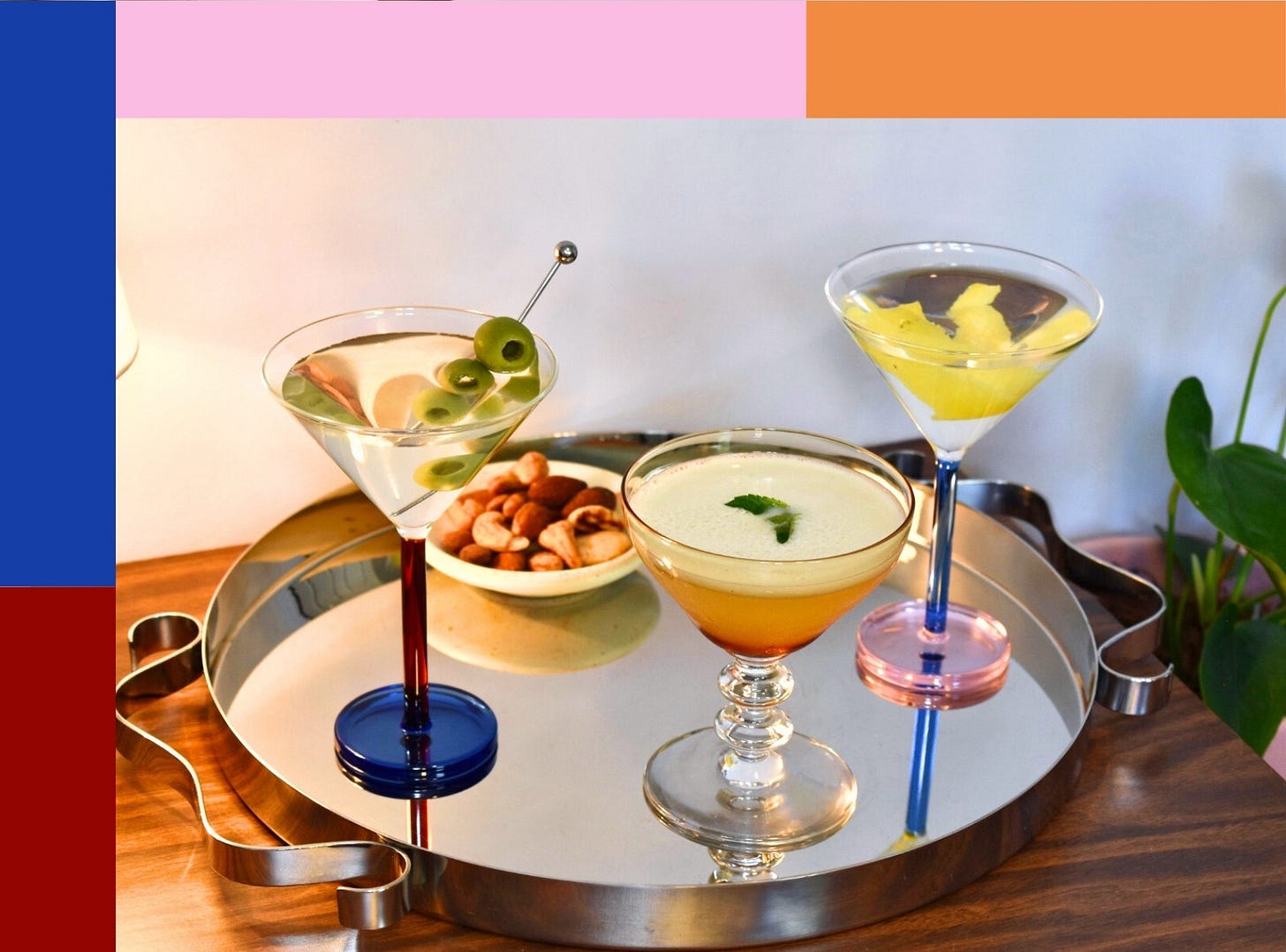
You may have gathered that glassware gets sizable real estate at my apartment—having taken over my kitchen cabinets, multiple shelves, and sprawling to my living room’s bar shelf. When you have glassware designed by Sophie Lou Jacobsen or score amber gems from Big Night’s vintage collection, why not show them off?
Glassware isn’t my only love—I’ve always been drawn to the textural element of textiles and have a deep appreciation for the craft of weaving. What started with introducing bright green napkins to my table scaled up to a multi-colored, patterned throw blanket adorning my couch, to eventually replacing the beige curtains in my bedroom with red striped ones. But am I ready to commit to that bold cornflower blue bedspread I’ve been eyeing? Not yet!
3. Ephemeral Pleasures
Want an approachable, low-risk way to try new colorways and learn which resonate with you? Try decor that’s short-lived, but big on impact. I’m talking candles and floral bouquets.
For me, candlesticks add a necessary soft glow in my living room (this is obviously an anti-big light household) while also providing colorful insights. If, at the end of the burn, I find the absence of that bright-colored soldier so profound, then I consider restocking it or adding more of that hue to my space. This was my gateway back to pink (that or my ex moving out).
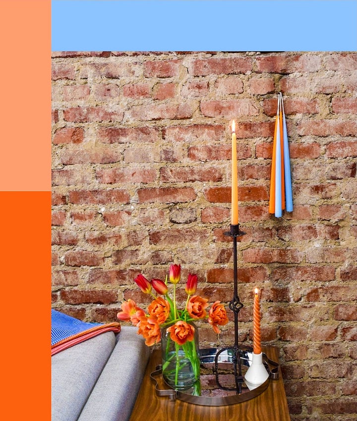
Recently, I also unlocked a tasty new color combination—sky blue and bright orange—thanks to this candlestick hanging, which also makes good use of the random nails in my otherwise unusable brick wall.
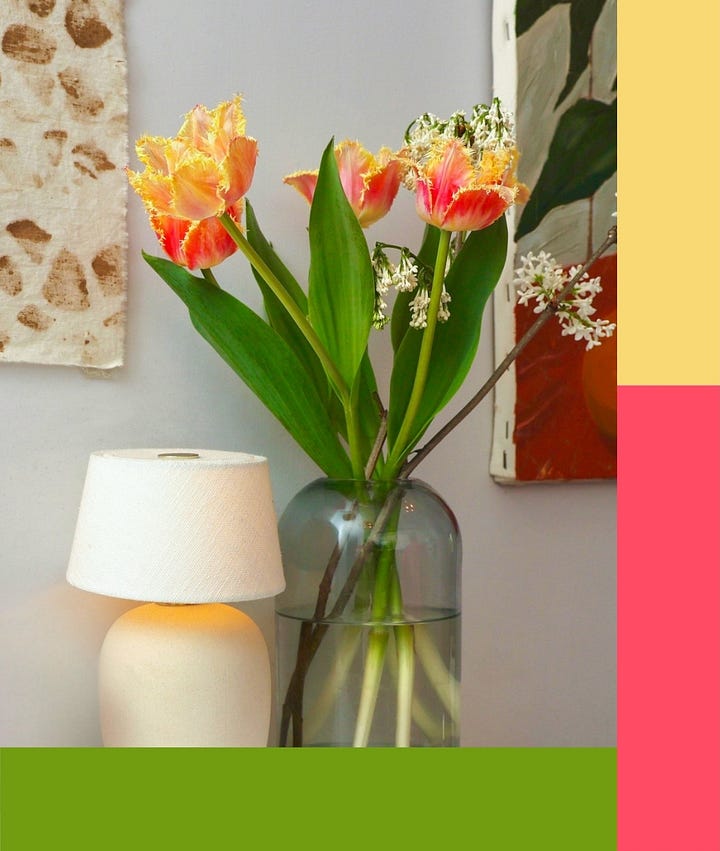
Flowers have been a great way to add life (and color) where plants don’t thrive, and arranging bouquets has become my favorite Sunday ritual. Aside from the artistic expression and meditative practice of cosplaying a floral designer, I use floral arrangements to welcome colors and combinations I don’t usually go for. By being less calculated, I try to honor the random, vibrant, effortlessly beautiful way of nature. It’s not always a hit, and that’s okay—it’s only a week of cohabiting.
Over time, little additions made my apartment all around more colorful and built my chromatic vernacular to what it is today. Perhaps the pieces that resonate with you are different than mine, but hopefully these concepts help guide you on your journey. With each microdose, your space becomes more vibrant—until one day, you look around and realize you’ve gone full color while feeling it’s just the right amount.
Now, to decide where you want to start microdosing color at home. Let us know in the comments!
You don’t have to choose: Mixed color sets are your best friend (and a hosting hack for knowing whose is whose). Make your own mismatch made in heaven or scoop up a pre-curated creation.
Nearly neutrals: Light blue, dusty pink, sage green, and mustard yellow are all safe bets to start with. In my experience, soft shades are the most approachable and easy to come by.
Try a fresh color palette: For me, setting the table is a practice in color, and right now I’m loving tomato red, butter yellow, and baby blue. Check out Color Combinations I Love of Food Pairings I’d Hate for more inspiration.

Yummy color combo meets lunch: ramp butter pasta x ceramic bowl, striped napkins, vintage flatware, and pepper grinder.
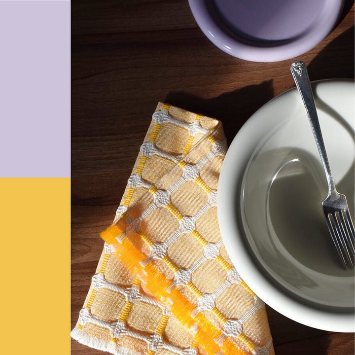
Setting the table with plates and napkins inspired by a familiar duo and CCILFPIH fav: mustard & grape.
As someone who loves an in-person shopping experience (I need to touch!), Big Night has one of the best. Whether it’s their West Village location or their recently renovated Greenpoint space, their store is every shoppy-shop girl’s dream—and yes, a colorful haven.
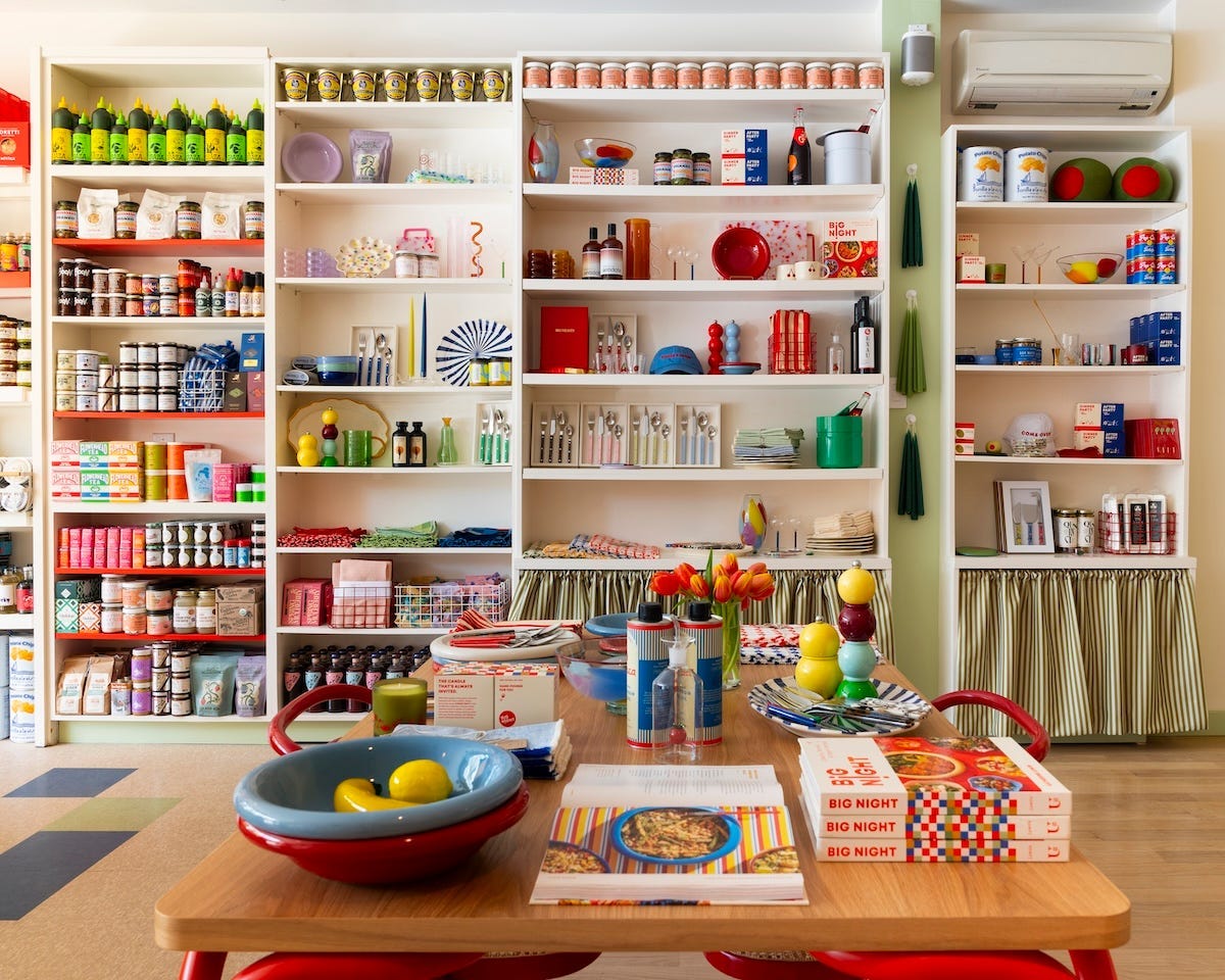
Want to talk more tips & tricks, or maybe some help deciding which color your living room needs? The No Crumbs community is ready to weigh in.
May is dedicated to all things color. Next week, I’m sharing unlikely sources for color inspiration (even Pinterest needs a break). Here’s a first taste: The Room Next Door (2024) by Spanish director, Pedro Almodóvar.
Want more?
Second servings are always welcome at No Crumbs! Dig into these reads, just in case you missed them the first time around.
Thanks for reading No Crumbs! If you enjoyed this piece, consider liking or commenting to help it reach others who might value it too—maybe even send it to a friend. As always, your support means everything.
I share bits of my life on Instagram and sporadically yell into the void on TikTok. I’d love to ✨collaborate✨ with fellow creatives or brands — say hello at kayroolaart@gmail.com.






LOVE big night
love this!! so many good ideas and such good colour schemes!